Index
1. What is a Stacked Column Chart?
2. When to use Stacked Column Chart?
3. Step By Step Guidance with DataInsider
1. What is a Stacked Column Chart?
A Stacked Column Chart is used to break down and compare each part of an entire group.
Each column in the chart represents an entire group, and segments in the bar display different parts or categories of that group.
In a stacked column chart, different colors are used to illustrate the different categories in the column.

2. When to use Stacked Column Chart?
A Stacked Column Chart is ideal for:
Data that is segmented and added to a whole
Comparision across the different columns
Compare the individual category of one category across the different columns, specifically whichever category is sitting on the axis, or any category where the bottom of its section of the column is in a consistent place across the columns
Compare the size of different categories if they're very different
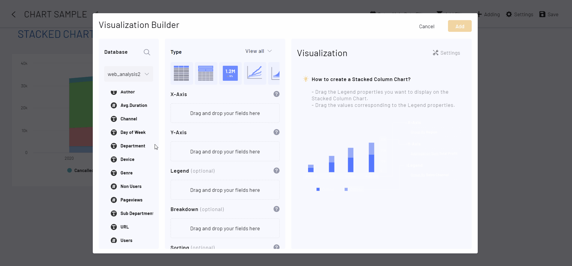
3. Step By Step Guidance with DataInsider
Desired chart: A stacked column chart that compares the Total Revenue across Item Types and shows how much each Sale Channel takes up each Item Type.
Step 1. Drag Department to X-Axis
Step2. Drag Pageviews to Y-Axis
Step 3. Drag Sub Department to Breakdown
Another type of stacked chart is the stacked bar chart. In the next chapter, we'll dive deeper into this kind of chart: Stacked Bar Chart